Skybox and Lighting changes
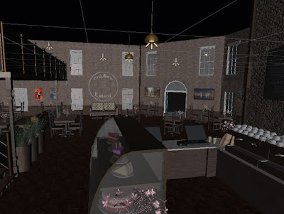
When it came to skyboxes and lighting I knew it was the last thing I needed to do to make the scene look presentable. I went through a few different versions of both lighting and skyboxes before I settled on the combination I preferred.
Skyboxes:
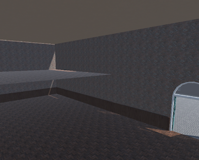
Original
Skybox 1
Skybox 2
I ended up settling for skybox 2, both skybox 1 and 2 look very similar, but within the actual scene, skybox 2 has a slightly darker and moodier look to it compared to skybox 1 which ultimately led to my decision
Lighting:
Lighting V1:
These lights were too intense and also too white, it made the café look more like a hospital than a café and it didn't fit the cosy vibe I was trying to aim for.
Lighting V2:
I lowered the intensity of the lights for the next test and it looked a lot better, however the lights were still too white and gave the café more of a stage look, as if everything were under the spotlight.
Instead of having white lighting I changed the lighting so it was slightly more orange/brown, this made it look less like a spotlight or floodlight filled room, however it still looked too harsh and out of place.
Lighting V4:
I changed the orange to a more yellow/ cream tone and also decreased the intensity and the lighting worked a lot better, I decided to keep the lighting like this.


Comments
Post a Comment